The History of the Rolling Stones Tongue and Lips Logo

Perhaps the most well-known logo in rock history is the iconic tongue and lips symbol made famous by the Rolling Stones. The logo was initially commissioned by the band in 1970, who at the time were looking for an artist to design a poster for their forthcoming European tour. The Rolling Stones team contacted the Royal College of Art in London for recommendations, and the college put them in touch with graphic artist John Pasche, who was then a Master of Arts student in the midst of his final year of schooling.
Pasche set up a meeting with Mick Jagger in early 1970 to discuss ideas for the poster, which had nothing to do with the later tongue and lips logo design. A week after the meeting, Pasche sent the tour poster design to the Stones, but Jagger was not satisfied with the initial design and turned it down. Pasche thought the initial rejection was the end of it, and that he would never hear from them again, but Jagger requested a revision saying that he knows John can do better. He then sent over another design that ended up being used as the official poster.
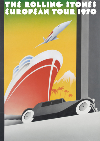
The final design sought inspiration from travel posters of the 1930s and 1940s, with a modern (for the time) twist that included the Concorde Turbojet. The band was pleased and followed up once again to commission even more art from John Pasche, including an official logo that they imagined would be used on note paper and other official band items.
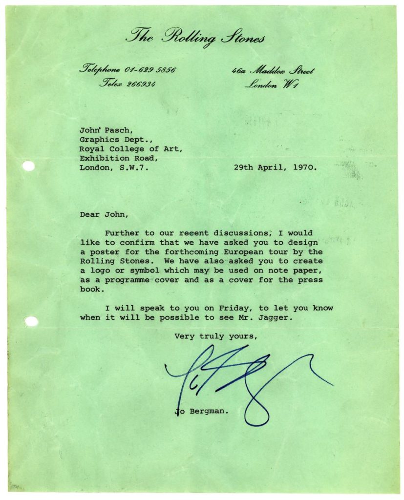
This was confirmed in a letter sent from Rolling Stones assistant Jo Bergman to Pasche, dated April 29th, 1970. The letter served as an official commissioning for the Rolling Stones logo. Pasche again met with Jagger shortly thereafter to discuss details on Jagger’s vision for the logo.
In their meeting, Jagger explained to Pasche that he wanted a very simple logo that could stand well on its own. Jagger also showed Pasche an illustration of Kali, the Hindu Goddess of Death, whom he had felt inspired by at the time. Jagger had perhaps imagined the Stones logo would take influence from Indian culture, but Pasche didn’t want to go that route.
In a 2015 interview with the New York Times, Pasche explains, “I didn’t want to do anything Indian, because I thought it would be very dated quickly, as everyone was going through that phase at the time.”
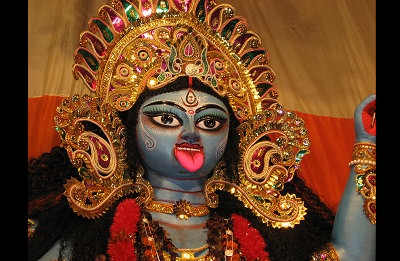
Pasche was looking for a logo that would stand the test of time, and did not want to go the trendy route. Instead he decided to zoom in on the lips and tongue of the Goddess Kali, as he felt there was something there to work with. While many people assume that the initial inspiration for the Rolling Stones logo came from Mick Jagger’s lips, Pasche actually did not have that in mind until further along the design process, when he realized that a connection could be made there.
Many fans, of course, later adopted that viewpoint and the logo came to eventually represent Mick Jagger’s lips, among other things. The logo also has sexual connotations and reminds one of the irreverent freedom of the counterculture; two more things that the Stones embodied and that Pasche had in mind while working on the design.
Pasche delivered the original Rolling Stones logo in black-and-white sketch form near the end of 1970, and the band paid him a mere 50 pounds, which is nothing compared to the ridiculous amount of money that has been made from this logo since.
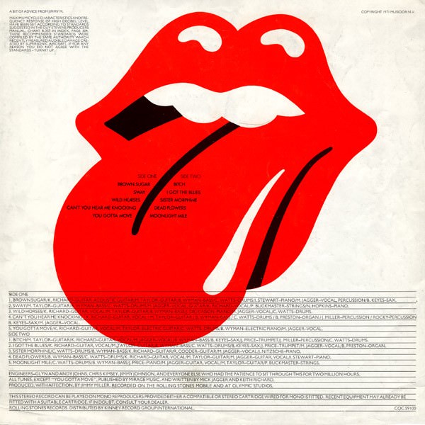
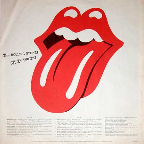
When the time came to arrange the art for the the Rolling Stones famous 1971 album Sticky Fingers (with help from Andy Warhol), they needed to finalize the logo for the U.S. version of the record and were short on time. The version that had been faxed over to New York did not come through in high enough quality to be used in any realistic way, and thus Craig Braun of Sound Packaging Corporation ended up re-drawing the logo.
Braun’s version of the tongue and lips logo modified the tongue to make it more narrow and added a second white line. He added a more prominent black outline to the tongue and deepened the black void at the back of the mouth, and re-shaped the teeth. This version of the logo is what was seen on the U.S. vinyl and is the one that the Rolling Stones eventually opted to use as their official logo, of which many variations have been made since.
To further the confusion about the original creator of Rolling Stones tongue and lips logo, there is another version of the design dating back to 1971, this time made by artist Ernie Cefalu. At the time Cefalu had been working under Craig Braun at Sound Packaging Corporation, and he also created a variation of the original design, which at the time was known as the “Licks” logo. It was included in an ad taken by Craig Braun for his “Rockcreations” in the 1971 issue of Rolling Stone magazine. Cefalu’s design was not used in its exact form on many Stones official stuff, but he is certainly a contributor to the overall mythos surrounding the logo.
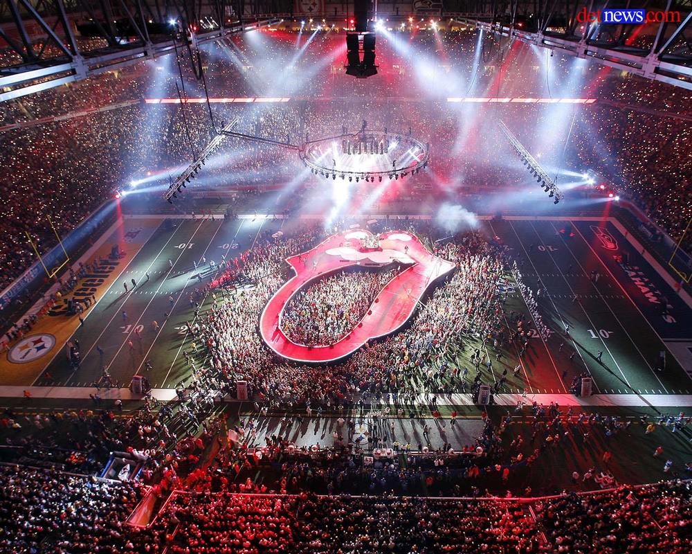
From 1971 on, every single official statement, music release, or poster to come from the Rolling Stones has featured some form of the famous tongue and lips logo. The band even decorates stadiums and constructs up their stages with the tongue and lips logo, the biggest-ever being the Super Bowl Halftime show in 2006.
In 2012, the legacy continued as graphic artist Shepard Fairey was commissioned to design an updated version of the iconic logo in celebration of the band’s 50th anniversary. Fairey is the artist behind Obamas’ Hope poster as well as the famous Obey Giant street art series, originating in Extra Chill’s hometown of Charleston, SC.
The Rolling Stones logo has become easily one of the most recognizable logos of all time, appearing on just about every merch item you can imagine, from Urban Outfitters t-shirts to coffee mugs and all sorts of fan art creations. In fact, in 2018 it was actually voted the “most iconic all-time t-shirt logo” by a poll in the UK. Even if you’ve never heard the music of the Rolling Stones (though you probably have), just about every living person on this planet has seen the Rolling Stones logo in some form or another. It’s an example, much like the Grateful Dead bears, of how pop-culture can become permanently engrained in the fabric of society, long after the pop-culture icon themselves have past their prime.