Pink Floyd’s 1973 album Dark Side of the Moon is iconic on many levels.
First and foremost, it is widely regarded as one of the best rock albums ever made. Packed with expansive, intensely psychedelic music, it continues to blow the minds of listeners of all ages today, nearly 50 years after the album first hit the shelves.
Perhaps even more iconic than the music itself, at least by today’s standards, is the triangular light prism symbol that appeared on the album’s cover.
Today, that prism in poster form graces the walls of college dorm rooms all over the world, and fills the shelves at stores like Urban Outfitters and more to be worn by people who may or may not have even listened to Dark Side of the Moon.
It’s become a symbol of psychedelia, the counterculture, and of course has come to represent not just the album Dark Side of the Moon by Pink Floyd, but has also become an all-encompassing logo for Pink Floyd themselves.
The logo was designed by the famed graphic designer Storm Thorgerson, in collaboration with Aubrey Powell for their company Hipgnosis.
Thorgerson and Powell are most well-known for their extensive work with Pink Floyd, but the pair also designed many other famous album covers, including Led Zeppelin’s Houses of the Holy and more.
The Dark Side of the Moon album cover was the one that truly made Hipgnosis famous, though, and the meaning of that prism has been debated far and wide ever since the day of the album’s release. The band themselves neglected to provide a meaning, preferring rather to let the fans speculate amongst themselves.
According to Mark Blake’s book Comfortably Numb: The Inside Story of Pink Floyd, the initial idea for the prism was born out of a late night brainstorming session between Thorgorson and Powell.
During these sessions, the pair would stay up until around 4am discussing creative ideas, taking full advantage of the eerie quiet and sleep-deprived mindset to come up with things they would never be able to think about at breakfast.
Thorgerson recalls seeing a photograph of a prism with a beam of light passing through it in a physics text book, and that got the wheels turning.
He showed the photograph to Powell, and then the idea was presented to the band, and they chose it among several other options presented (there was even a design featuring the Silver Surfer).
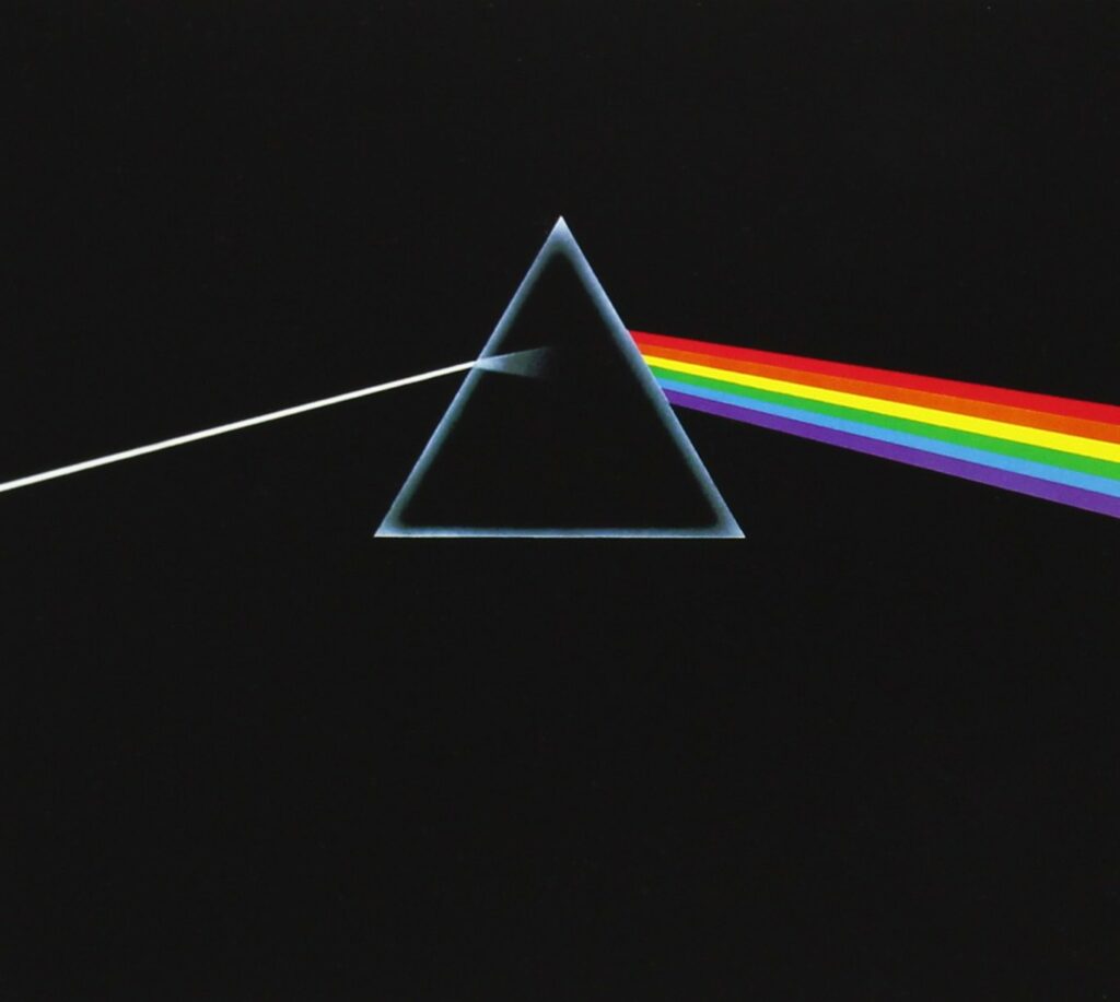
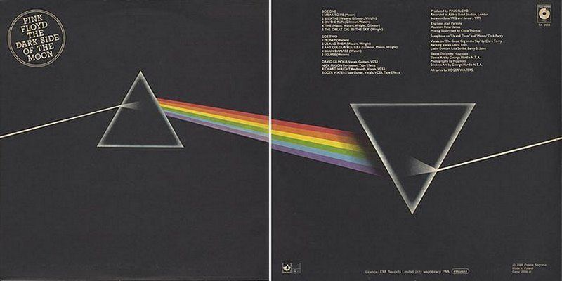
The final front cover design features a triangular prism, with a beam of light passing through from the left side, resulting on a rainbow beam shooting out of the right side. Set to a black background, the prism was also mirrored on the back cover giving the effect of a consistent beam of light that never ends.
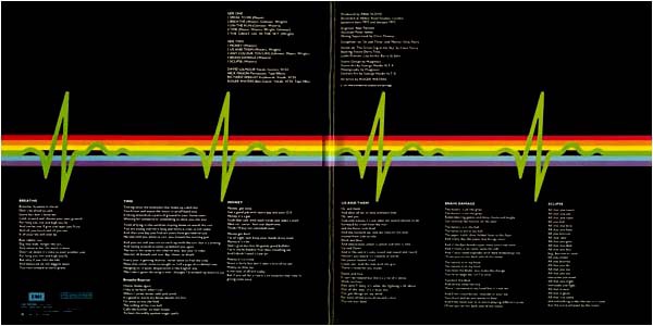
When you flip the record open, the rainbow beam spans across the entire inside cover, with a green heartbeat pattern over top of it. The band’s name is not included anywhere on the design, a deliberate choice and one that has proven to be genius over the span of time.
Much of the speculation about the Pink Floyd triangle symbol boils down to meanings that parallel some of the themes explored in the music.
Fans discuss how the white beam of light passing through the triangle represents the start of life, and the rainbow beam represents all the paths and influences one may take during their lifetime.
The continuation of the design on the back is said to represent the cyclical nature of life. The heartbeat passing through the middle of the record represents a human thread running through it all, with emotions and struggles that are contained within this life cycle.
While all the speculation is interesting and a true mark of the impact of Dark Side of the Moon on society as a whole, the truth is that the album cover was not made with a specific deep meaning in mind. According to a 2010 interview with Rolling Stone, Storm Thorgerson was inspired by the light show that the band had been producing at their concerts at the time.
Storm explains that while he had heard some of the album prior to making the art, he was in fact not inspired directly by the music while making the design. He does place emphasis on the triangle as a symbol of thought and ambition, and relates it to the themes present in Waters’ lyrics.
Because of the impact made by Dark Side of the Moon, the prism became synonymous with Pink Floyd, and that psychedelic image is likely to pop into your head whenever you think about them.
As Storm says, “the prism belonged to the Floyd”, and still does.