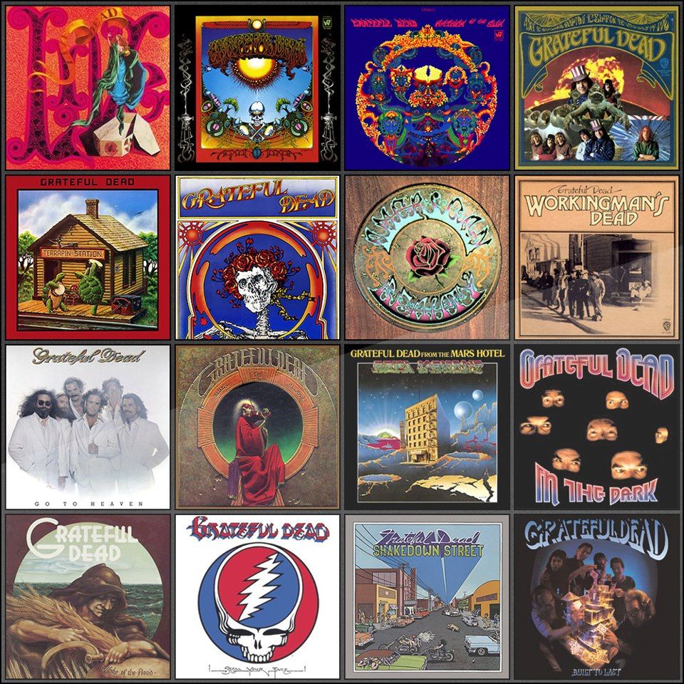
The Grateful Dead released a respectable thirteen studio albums over the course of their 30 years as as band, and of course hundreds of live albums, their bread and butter.
In fact, the Grateful Dead machine is still releasing new live albums to this day, and have continued to do so ever since the late 1960s, when they released their first live album, Live / Dead (1969).
While the music is certainly very special, for this article we’re going to focus on Grateful Dead album covers.
Each album features a unique design that goes hand-in-hand with the psychedelic and goofy nature of the band. Some of them even have interesting stories attached to them.
As much as we would love to list out every single Grateful Dead release, including all the live albums and Dick’s Picks and all that good stuff, we would all be here for the next three months.
So for the scope of this article I’ve stuck with just the thirteen studio albums and the main live albums that were part of their major label obligations.
Since I couldn’t help myself, I’ve also included a bonus image-only section after the main releases with more cool Grateful Dead album art that I’ve dug up on the web.
Keep on truckin’!
The Grateful Dead (1967)
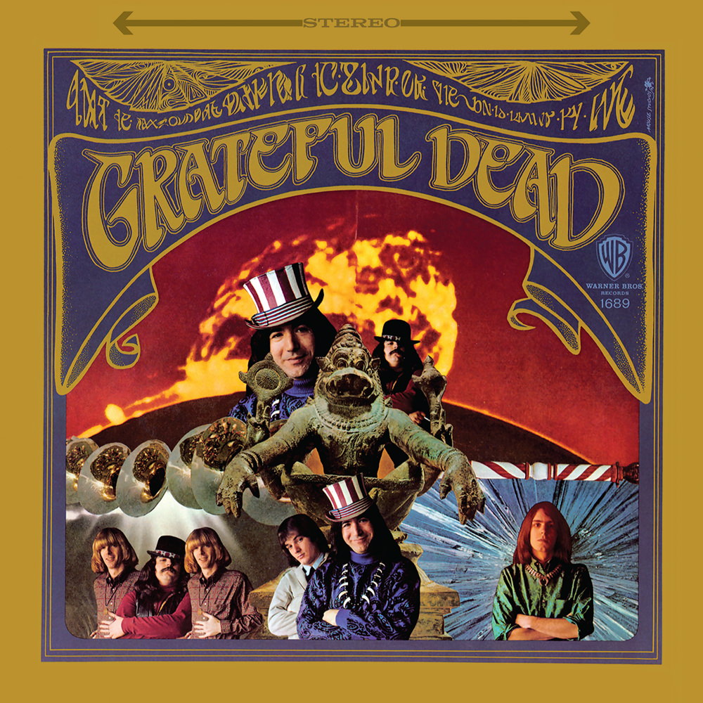
The Grateful Dead ‘s first album cover was designed by Stanley Mouse in collaboration with Alton Kelley, a pair that would create a whole lot of trippy Grateful Dead art over the years. The photo of the band was taken by Herb Greene, and then Kelley turned it into a collage and mouse assembled the actual cover design.
This was the first of many times that we would see the Dead using typography that is intentionally difficult to read. The words at the top read, “In the land of the dark the ship of the sun is driven by the / Grateful Dead”. Apparently the reason for this was spontaneous, as Jerry Garcia explained in an interview with Ralph Gleason in 1969:
We didn’t like it because we thought it was a tad pretentious. So we talked to Stanley [Mouse] and said could you do something that almost says something but doesn’t quite. The result of that has been that all the places we’ve been where people have had the album, we’ve been able to hear their translations.
Jerry Garcia, 1969
Also featured on the cover is a low-angle shot of a statue of the Man-Lion avatar of the Hindu god Visnu, Yoga-Narasimha, which was on display at the Nelson-Atkins Museum of Art in Kansas City at the time. One blogger dives deep into how Kelley may have acquired that photo.
Anthem of the Sun (1968)
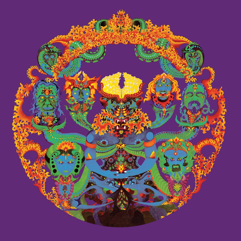
Anthem of the Sun came a little more than a year after the band’s debut album, and both the music and the album cover was more in line with the psychedelic sound that the Dead had been exploring at the time.
The painting used as the album cover was done by Bill Walker, whom had been asked to do the album cover by Phil Lesh earlier in 1968.
According to Rock Skully, who was a Grateful Dead manager from 1965 to 1985, the band had initially wanted to give the record a white background, but Warner Bros. Records overrode them and instead went with purple, perhaps to draw a connection between the Dead and the Jimi Hendrix song “Purple Haze”, which was massively popular at the time.
Skully says the band was pissed to see that their album had been released with a purple background, as it took away from the vision that they had creatively. Skully also attributes the cover art to the wrong artist, so I would perhaps take what he says with a grain of salt.
There was a remix of the album released by Warner Bros. in the late 70s, with the white background, but it was too limited a pressing to take hold and plus, by then it was too late. People already knew Anthem of the Sun for that thick purple color.
In 2018, a series of prints surfaced featuring a more advanced version of the cover artwork as finished by Bill Walker sometime in the late 80s. They were apparently what remained from 300 original prints that he had printed, and were lost for many years. They are now on sale for a cool $4k a piece. Learn more about that here.
Also check out Bill Walker’s 33-page guide to the Anthem of the Sun artwork here.
Aoxomoxoa (1969)
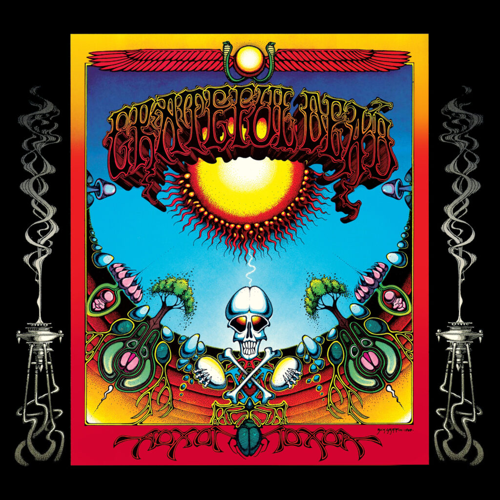
The Aoxomoxoa album cover is the most well-known of many collaborations between the Grateful Dead and the renowned psychedelic and surf artist Rick Griffin. The vibe is interdimensional psychedelia, with a bit of a cowboy thing going on as well. As it turns out, “interdimensional cowboy psychedelia” is also a good way to describe the music that the Dead were making at the time.
As this is the Dead’s most experimental studio album, one might assume it was inspired by all the LSD that the band was known to have been eating at the time. Griffin designed a special nugget into the cover in the form of an ambigram, or a word that is written in a way that it can be seen as more than one thing. If you look closely at the top of the cover, where it says “Grateful Dead”, you might notice that it also says “We Ate The Acid”.
The album also featured a group photo on the back cover that included many figures, including whom many assumed to be a 5-year-old Courtney Love. It was later revealed that this young lady actually Stacy Kreutzmann, daughter of drummer Bill.
Griffin went on to design several more album covers for the Dead, plus many of their concert posters throughout the 60s. See an archive of his Grateful Dead, Jerry Garcia, and other poster designs here.
Live / Dead (1969)
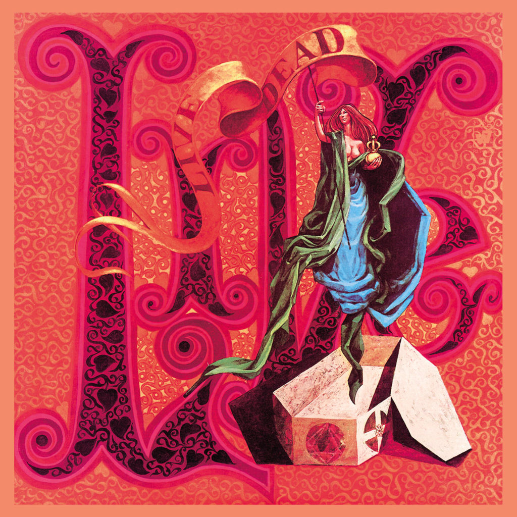
Live/Dead is the album that changed everything for the Grateful Dead. It was their first live album, recorded over various tour dates at the Fillmore West in winter 1969, and it opens with the most famous version of “Dark Star” of all time, an absolute mind-bender.
As the title suggests, Live/Dead served as a way to show people what the Dead sound like in a live setting, as the previous two albums had been very much studio experimentations. This album was passed around by the earliest of Deadheads and helped to create an underground following that would expand and eventually become the cultural phenomenon that we know it as today.
The psychedelic art on the album’s cover is made from an original oil painting by Bob Thomas, an artist who frequently worked with the Dead in the early days. He designed both of the band’s most iconic images: the Grateful Dead “stealie” logo and the dancing bears, and more.
Thomas painted the front cover as well as the back cover, which features the word Dead set against a warped american flag design, to juxtapose the trippy woman floating out from a coffin and the word Live on the front.
Both of these original paintings, as well as a drawing of the original concept art for the floating woman, were sold at an auction in 2007 for $87,000.
Workingman’s Dead (1970)
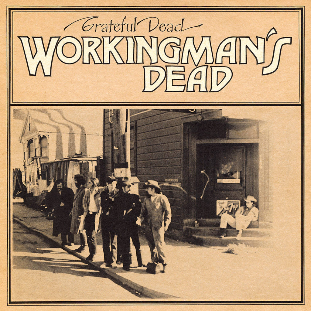
Stanley Mouse steps back into the picture in 1970 with the cover design for Workingman’s Dead, one of the Grateful Dead’s studio albums. This album marked a step away from the extremely experimental psychedelic music they had been making in the late 1960s into a more country-influenced folk rock sound and a focus on the songwriting of Jerry Garcia and Robert Hunter.
The cover design features a photograph of the band, including lyricist Robert Hunter at far left, standing on a street corner in San Francisco. Next to Hunter is Jerry, then Bob Weir, then Phil Lesh, and Pigpen. Drummer Bill Kreutzmann is perched on the staircase next to the 7up sign.
One blogger went and found the actual address of this street corner, which obviously looks much different than it does today, also explains their methods. You can check that out here.
Mouse also designed the back cover, which featured six airbrushed portraits of the members of the Dead at the time of this album’s release.
Apparently, those back portrait photos initially featured the band members holding guns, but Robert Hunter was quick to shoot this down:
I saw that photo, and that was one of the few times I ever really asserted myself with the band and said ‘No – no picture of the band with guns on the back cover.’ These were incendiary and revolutionary times and I did not want this band to be making that statement. I wanted us to counter the rousing violence of that time. I knew that we had a tool to do it, and we just didn’t dare go the other way. Us and the Airplane: we could have been the final match that lit that fuse, and I went real consciously the other way.
Robert Hunter on Workingman’s Dead cover art
It’s probably for the best that they didn’t use guns, for the reasons that Hunter states above. But they would have fit right in with the old-timey nature of both the cover art and the roots-oriented feel of the album’s music, so I can see where Mouse was coming from with that idea.
American Beauty (1970)
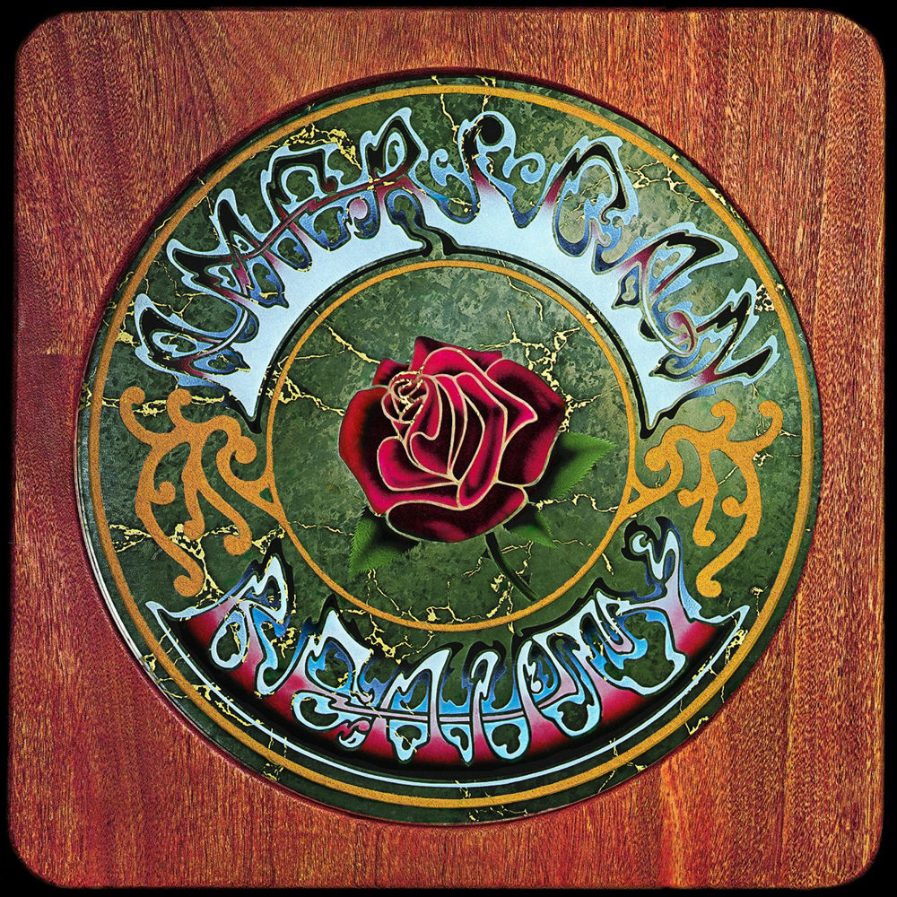
American Beauty was released in 1970 and served as a companion album to Workingman’s Dead, released earlier that same year. The album is in the same realm of roots rock songwriting as Workingman’s Dead, with an even more accessible collection of Americana songs on this one. This is the Grateful Dead’s most famous studio album and it comes in close competition with Workingman’s Dead for their best one.
The cover saw Stanley Mouse having a hand in things again, along with his partner in crime Alton Kelley, who had created the Dead’s debut album cover together.
This album cover brings the imagery of the rose to the surface, which is one that would become associated with the Grateful Dead for the rest of time.
Like the cover of The Grateful Dead, the American Beauty cover art also features text that can be difficult to read, but instead of purposely illegible like the debut, this cover contains another ambigram. If you look closely at the trippy font that displays the album’s title, you’ll notice that it also can be read as “American Reality”.
Skull and Roses (1971)
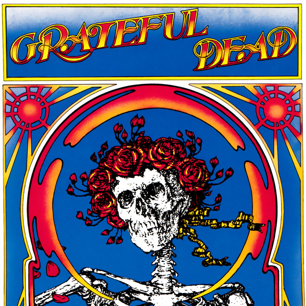
1971’s Skull and Roses, also known as Skull Fuck or simply The Grateful Dead, was the band’s second-ever live album. Unlike it’s predecessor, Skull and Roses was created with a few studio embellishments and thus sounds a bit crispier than Live/Dead, and is markedly less psychedelic.
The Skull and Roses cover art contains the iconic Grateful Dead skeleton wearing a wreath of roses figure, which fans now know as “Bertha”, named after the song of the same name that opens this album. It is yet another Kelley-Mouse creation.
Some may assume that this is where the skeleton made her debut, but she was actually first used on a concert poster made by Mouse and Kelley in 1966, for the Dead’s two night stand at the Avalon Ballroom in San Francisco that September.
They found their inspiration for the skeleton while digging through library books in the mid 1960s,
The artwork was so fitting for the band that it made a reappearance on Skull and Roses and was used many, many times in different forms going forward, including on an official logo used by the band. Mouse discussed this with the Washington Post in 2015:
We [Miller and collaborator Alton Kelley] would go to the San Francisco library and peruse the books on poster art. They had a back room full of books you couldn’t take out with great references. We were just going through that and looking for something. And found this thing and thought, “This says Grateful Dead all over it.” I hate to say this, but Kelley cut it out with a pen knife. I always say that we Xeroxed it, but there weren’t Xerox machines then. I finally found it about two years ago, the actual cut-out piece, and I went, “Oh, my God.” It’s from the book of poems “The Rubaiyat of Omar Khayyam.” The edition was done by an artist called Edmund Sullivan. And the poem that goes with this illustration is fantastic. It’s short and sweet and had to do with wine, women and song.
Stanley Mouse on the inspiration behind Bertha
Europe ’72 (1972)
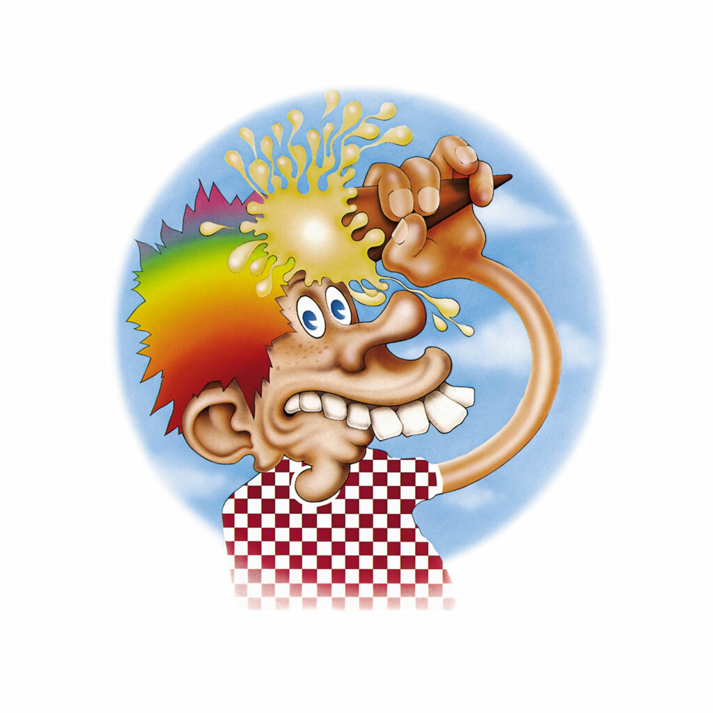
Ah, Europe ’72, one of the band’s most popular releases and the gateway drug for many a Deadhead. The cover design features the infamous ice cream kid logo that just screams “LSD”. It was another one of the iconic Dead images created by Stanley Mouse and Alton Kelley.
We’d go into more details, but we’ve already published a full feature on this artwork. You can learn everything you need to know about the Grateful Dead ice cream kid in our feature on it here.
History of the Grateful Dead, Volume One (Bear’s Choice) (1973)
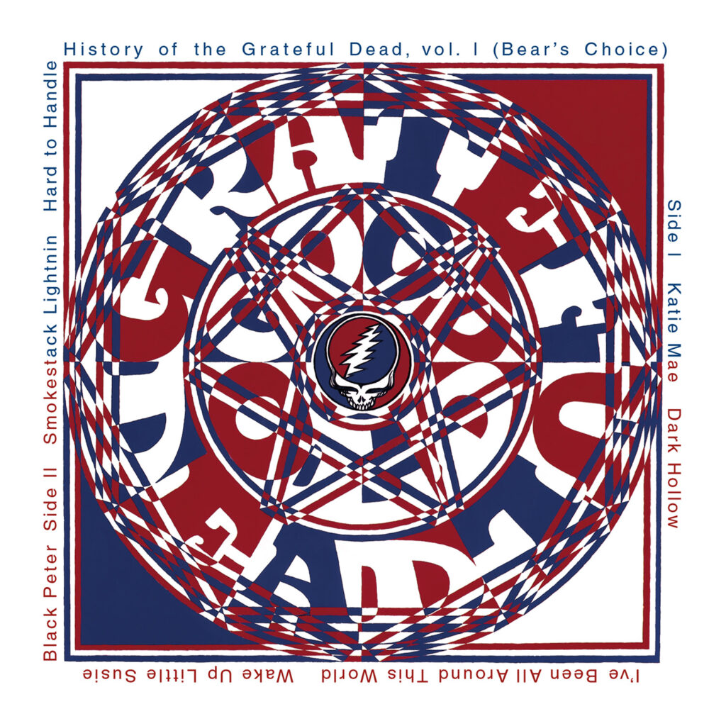
The 1973 live album The History of the Grateful Dead, Vol 1: Bear’s Choice is a strange one, as it features an acoustic-heavy assortment of songs that doesn’t really represent the sound of the Dead all that much. It was a selection of hand-picked recordings from the Dead’s acid chemist, investor, and sound engineer Owsley “Bear” Stanley.
The Bob Thomas-designed Bear’s Choice cover art is iconic for two reasons. For one, it was the first Grateful Dead album cover to feature the Steal Your Face logo, though it was not yet known as that. It was also the first album to feature the dancing bears, which were depicted around the border of the back cover.
You can learn more about this album cover as well as the iconic logos included on it in our full feature on the dancing bears, which can be found right here.
Wake of the Flood (1973)
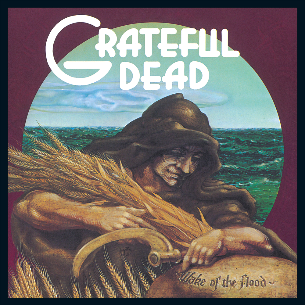
1973’s Wake of the Flood was the first studio album from the Dead since their two classics, Workingman’s Dead and American Beauty first changed their sound in 1970. It was the first album that they released on their own record label, Grateful Dead Records.
This was also the first studio album created without founding keyboardist Ron “Pigpen” McKernan, who had died of liver failure in March of 1973, and the first one created with Keith Godcheaux on keys and his wife Donna Jean on vocals. It marks another shift in their sound, and also contains many songs that will soon become live staples for the band including “Mississippi Half-Step”, “Row Jimmy”, “Stella Blue”, and “Eyes of the World”.
The Wake of the Flood cover art was designed by psychedelic saint Rick Griffin, his second album cover design for the band. It features an intricate portrait of a hooded figure grasping a bundle of wheat, with a moderately rough sea brewing behind them.
The strength in this one comes in the soothing fall color palette and the detailed lines that can be seen on the figure’s face. If you really stare at it for a while you may find yourself lost in the minutia, which tends to work perfectly while listening to the jammy tunes on this record.
Griffin’s original drawing of the artwork was sold at auction in 2013.
From the Mars Hotel (1974)
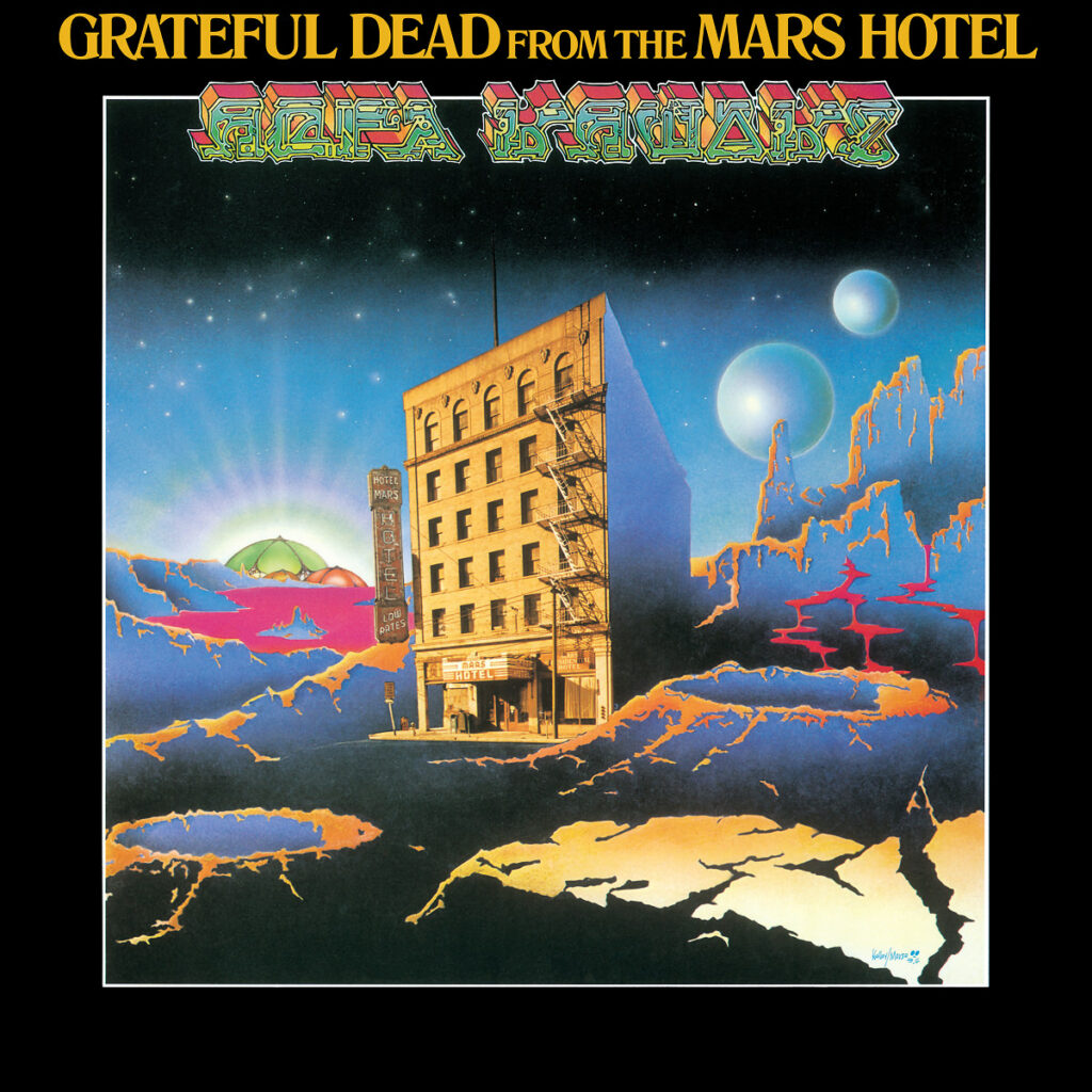
From the Mars Hotel, released in 1974, features a cover design by the Mouse/Kelly combo once again. The cover art depicts the image that is brought to mind by the album’s cover, showing an actual hotel on the artists’ rendition of the planet Mars, except it’s rendered to look almost like a negative. The design is weird and psychedelic, and right in line with the strange ethos of the Grateful Dead.
The cover plays games with trippy fonts once again by including an illegible phrase at the top of the cover, just below the album’s title. This is a purposely-placed hidden message that is revealed if you hold the vinyl record upside down in a mirror. When you do this, the words revealed are “Ugly Rumors”.
Initially, the Dead had planned to call this album Ugly Roomers, which was the band’s way of making fun of themselves and their rowdy behavior, and later changed that to Ugly Rumors. When they came up with the final title, From the Mars Hotel, they decided to include the working title in this way as a gag of sorts.
The back cover includes cartoon representations of what one might imagine are the Dead hanging out in their room at the Mars Hotel.
It’s important to note that this was released during the months before the Dead’s hiatus, when they were partying their asses off (weren’t they always?). Their shows during this time period were zany and spectacular and I highly recommend you check them out. Dick’s Pick’s Volume 12 is a good place to start, taking place during the week of the album’s release, June 26-28, 1974.
Musically, From the Mars Hotel includes live favorites like “U.S. Blues”, “Ship of Fools”, and of course the beloved “Scarlet Begonias” (later covered by Sublime), complete with Donna’s wailing at the end. It also includes “Unbroken Chain”, a song that was never played live until the Spring of 1995. See the “Unbroken Chain” breakout on 3/19/95 here, complete with amazing crowd reaction.
Blues for Allah (1975)
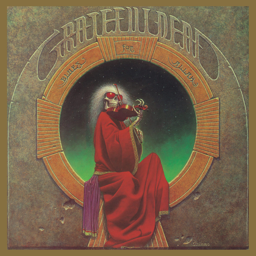
1975’s Blues For Allah album cover features one of the coolest artworks seen on a Grateful Dead studio album, in my personal opinion. This is, of course, the iconic electric-haired skeleton draped in a majestic red robe, playing the fiddle with bright red sunglasses covering his eyes. The skeleton is perched on a ledge with a green galaxy behind him, which a styling that seems to foreshadow the band’s 1978 trip to Egypt.
The image is derive from a painting known as “The Fiddler” created by the artist Phillip Garris, who also created several other Dead artworks over the years, including the cover art to Bob Weir’s side project album Kingfish (1976). Garris painted The Fiddler in the summer of 1974, and a number of prints were reproduced.
Musically, Blues For Allah contains a handful of songs that were live staples, including the “Help on the Way” > “Slipknot” > “Franklin’s Tower” sequence that fans adore. These songs were all written and developed from scratch in the studio as opposed to being developed live on stage. They also recorded the whole thing in Bob’s home studio, their first time using a non-commercial studio setting.
This intimate setting allowed the Dead to channel the energy that they channel in a live setting in the studio, giving us their most out-there studio album since 1969’s Aoxomoxoa, yet much more laid back and jam-driven than the raw psychedelia of their early days.
On a personal note, Blues For Allah will always hold a special place in my heart because “Franklin’s Tower” was the first Grateful Dead song that stuck with me, after my roommate spun it for me back in college on their Greatest Hits album.
Steal Your Face (1976)
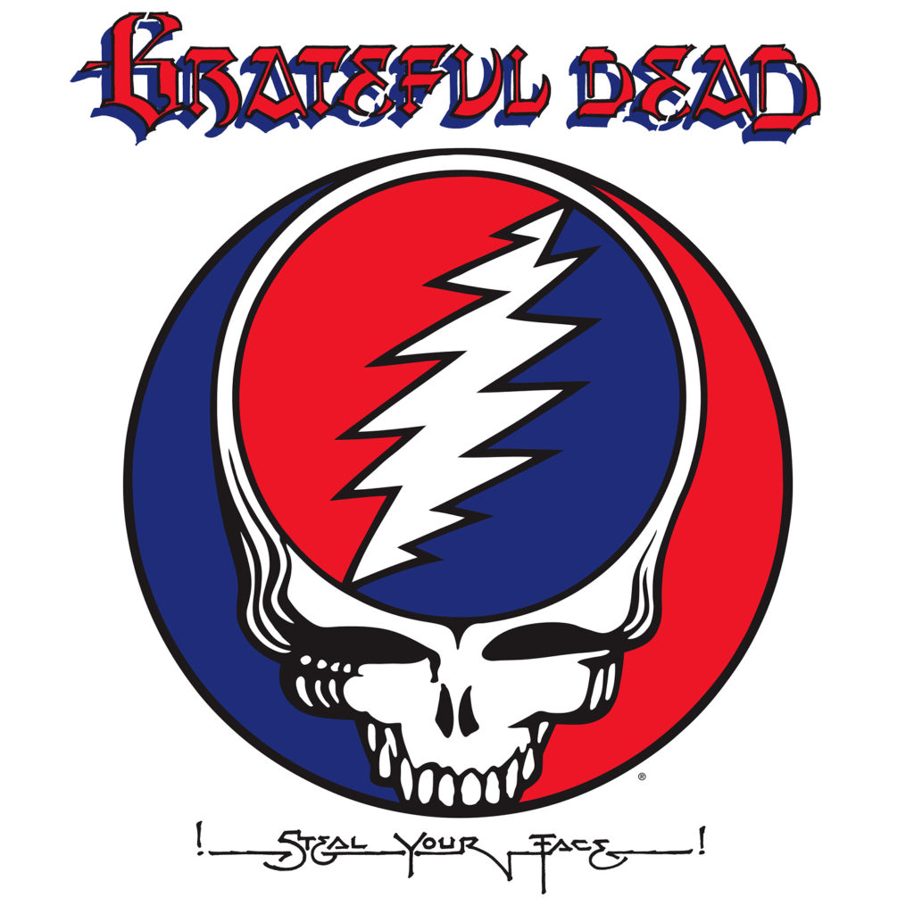
The 1976 live album Steal Your Face featured a giant stealie on the cover, and marked the first time that the band’s iconic logo was given a name. The album contains recordings from their “farewell” shows that took place before their hiatus in 1975, in October of 1974. These shows were also the subject of The Grateful Dead Movie, released in 1977.
We wrote an entire piece of the history of the Steal Your Face logo, and you can check that out here.
Terrapin Station (1977)
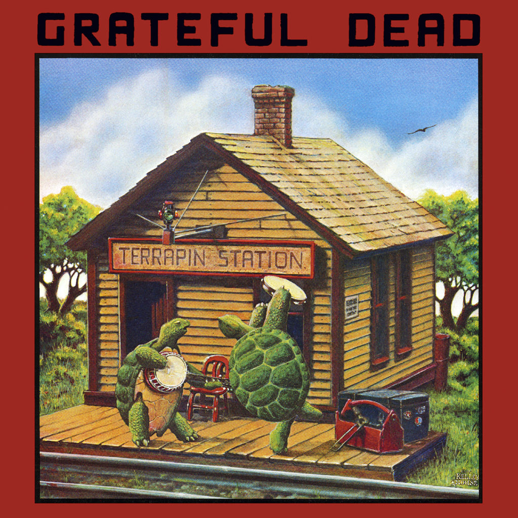
Terrapin Station was released in 1977, during what many see as a peak period for the band, and includes the Dead’s studio cover of “Dancin’ In The Streets” as well as the behemoth “Terrapin Station Medley” that was a live staple.
The album art was designed by Alton Kelley and Stanely Mouse, and introduced the terrapin turtle icon to the lore of the Grateful Dead, which are defined by the lyrics to “Terrapin Station”.
We’ve written all about the Grateful Dead turtles and the Terrapin Station cover art in a full feature that you can find here.
Shakedown Street (1978)
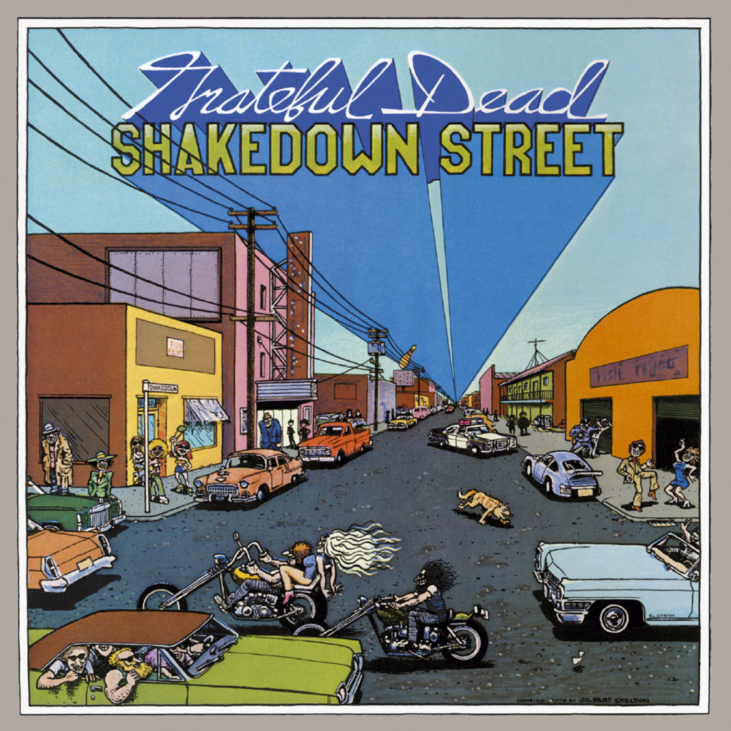
1978’s Shakedown Street features cover art inspired by the song of the same name, on the album that introduced a movement known as “disco dead”. This was due in part to the fact that the album was produced by Lowell George of Little Feat, but also because the Dead were always trying to innovate and disco music was extremely popular in the late 70s. Their shows were already parties, so why not make some music that feels like a party, right?
Designed by the renowned comic artist Gilbert Shelton, the Shakedown Street album cover depicts the Front Street, San Francisco area where the Dead had a practice studio and storage space in the mid-70s. The characters included in the illustration are picked straight from the world that Gilbert Shelton had become known for creating, especially The Fabulous Furry Freak Brothers.
The Shakedown Street album cover has a great vibe and a creative idea behind it, representing something from real life. It has inspired many artists since its release, including Bay Area punk Richie Bucher, who designed Green Day’s Dookie cover art in the early 90s.
The back cover of Shakedown Street features a lesser-known character in the Dead iconography, “The Invisible Pimp”, also sometimes known as “The Doo-Dah Man” invented by the “Truckin'” lyrics.
Go to Heaven (1980)
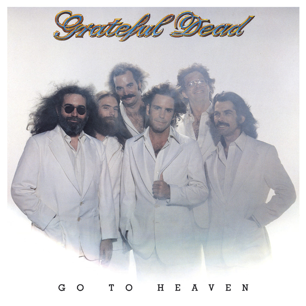
The Grateful Dead were quick to embrace the 80s, as seen by the ridiculous cover art for 1980’s Go To Heaven. The iconic photo was shot by the provocative rock photographer Bob Seidemann, and features the band dressed in all white, with the wind blowing in their hair. Of note is that the entire band has grown their hair out at this point.
Go To Heaven was not well-received, though it did include “Althea”, which is one of the best Grateful Dead songs to come from the post 70s era. It makes one wonder what the song would have sounded like if they had been playing it in the early 70s. One tries not to ponder on these things for too long.
This was also the first Dead album made with keyboardist Brent Mydland, who joined the band after Keith and Donna departed in 1979. Brent is right there behind Jerry in the cover photo, looking young and rosy-eyed.
Reckoning (1981)
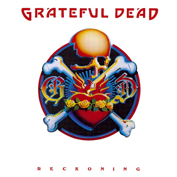
Reckoning is popular Grateful Dead live album released in late 1980, featuring acoustic live performances recorded during their Fall Tour. The album cover is another Rick Griffin original. This time, Rick goes with a styling inspired by traditional tattoos, with his own little psychedelic spin on it.
An original sketch of the Reckoning artwork was sold at auction in 2008 for $2400.
Dead Set (1981)
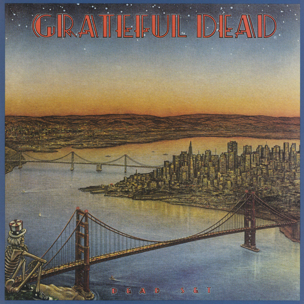
The companion release to Reckoning is 1971’s Dead Set, featuring more material from the band’s fall tour in 1971. The Dead Set cover art features a skeleton atop the Marin Headlands, overlooking the Golden Gate Bridge and the San Francisco skyline.
Dennis Larkins is the artist responsible for creating the Dead Set cover. He also created posters for the band during this time period.
Dead Set is a solid record that contains a gnarly “Fire On The Mountain” right out of space, on a rare occasion without “Scarlet Begonias”. The mix isn’t great but it’s worth a listen nonetheless. Check that out here.
In The Dark (1987)
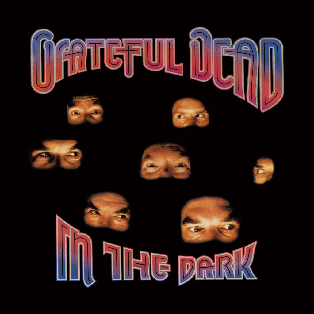
Best known for being the album that introduced “Touch of Grey” to the masses, 1987’s In The Dark was the Dead’s first studio album in 7 years and it’s not so bad. It’s got the Brent favorite “Throwing Stones” plus “Black Muddy River”, which is the last song that Jerry Garcia ever sang.
Bay Area artist Randy Tuten, which features photos of the band members faces arranged in the shape of an eye. You may notice that there is a seventh pair of eyes but only six people in the band, and you would have counted correct. The extra set of eyes belongs to the famous promoter and friend of the band Bill Graham.
Built to Last (1989)
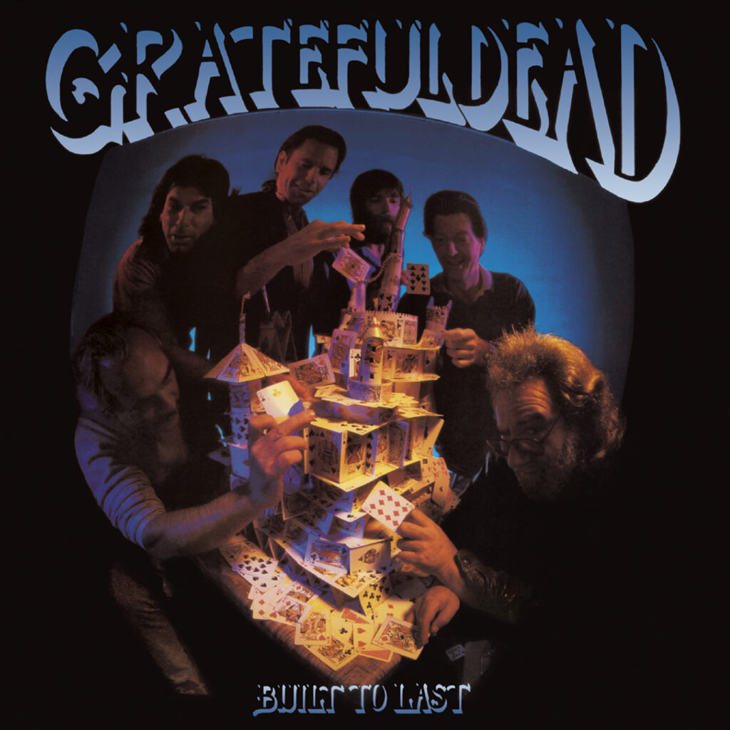
It’s ironic that Built To Last is actually the final Grateful Dead studio album, with cover art from the mind of Alton Kelley. Even more ironic is that the album cover features a house of cards that comes crashing down. It’s not like they knew that the end was near at this point, in fact they were in the midst of a late day renaissance.
While the Grateful Dead themselves came to an end with the death of Jerry Garcia in 1995, the music has lived on with a vibrant energy for nearly thirty years since then. It’s clear that the Grateful Dead truly were built to last, even if the original band members can’t live forever.
Without A Net (1990)
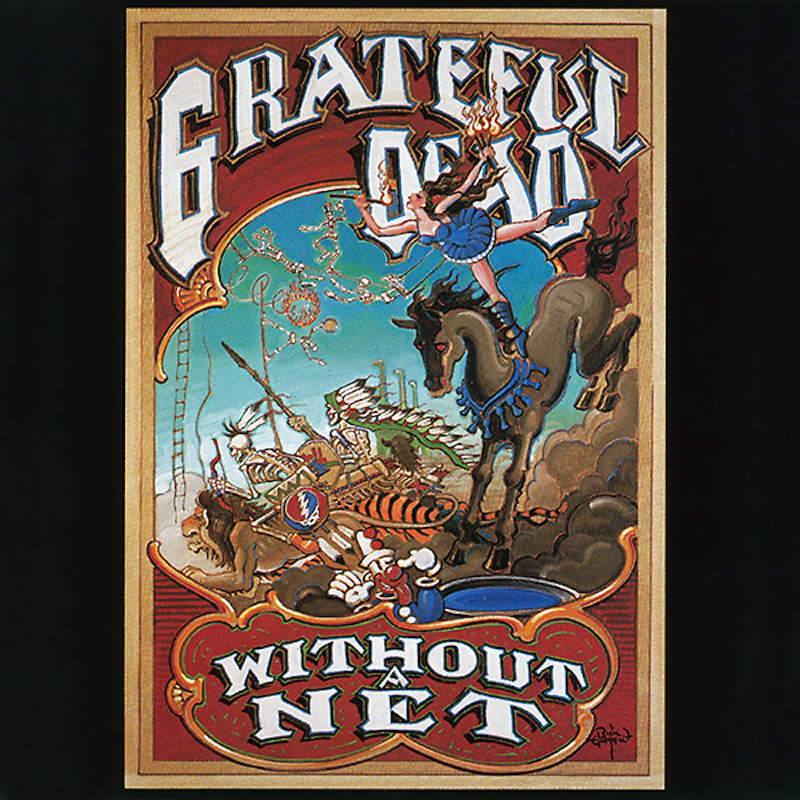
Without A Net, released in October 1990, was the first big live album from the Grateful Dead since Dead Set (1981). It was their best-selling live album at the time, reaching Gold status within a short period of time. The album contained selections of performances from October 1989 to April 1990.
The cover was designed by the Rick Griffin, friend of the band and influential psychedelic artist, who sadly died in a motorcycle accident in August 1991. Without A Net marks his final collaboration with the Grateful Dead.
Without A Net also includes the famous “Eyes of the World” with Brandford Marsalis. from 3/29/90.
More Grateful Dead Album Covers
Capitol Theatre, Passaic NJ 4/25/77 (2016)
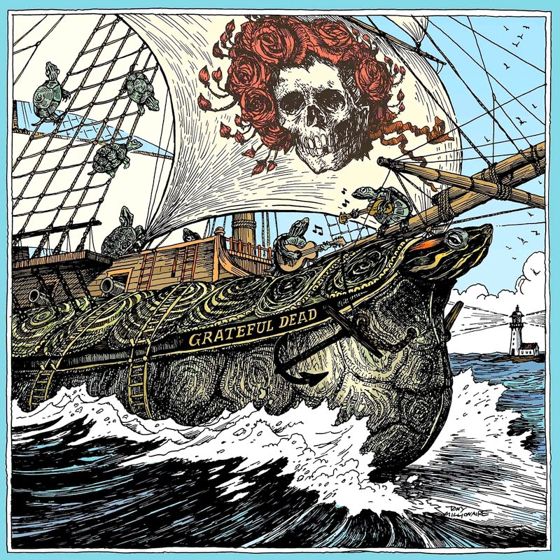
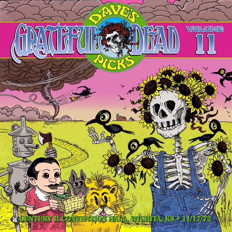
Dave’s Picks, Volume 11: Century II Convention Hall, Wichita, KS 11/17/72 (2014)
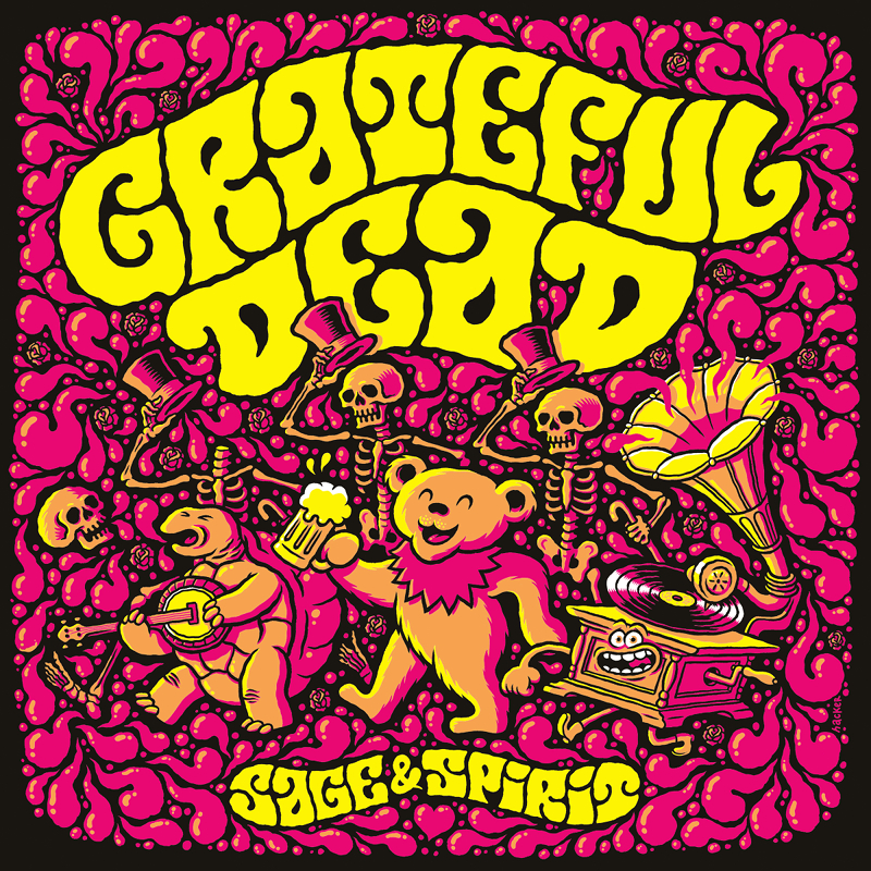
Sage & Spirit (2019)
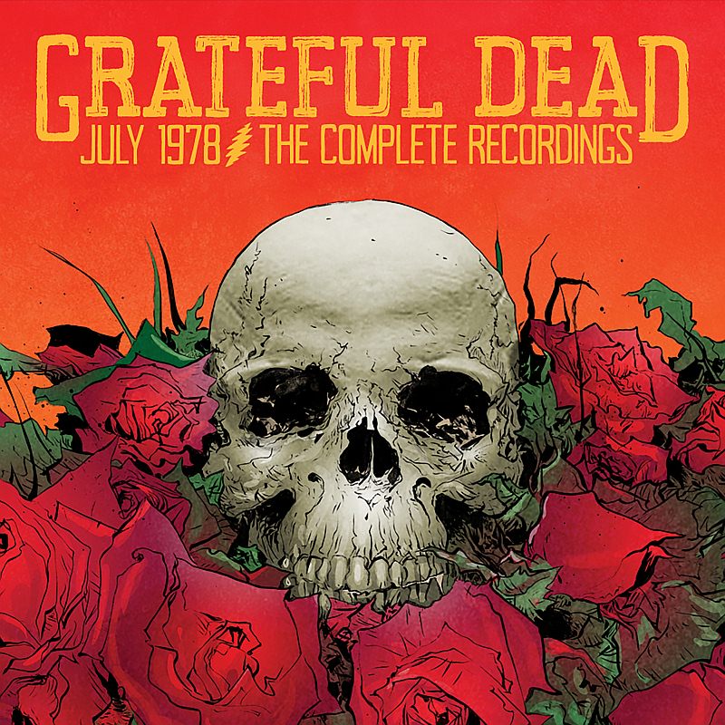
July 1978: The Complete Recordings (2016)
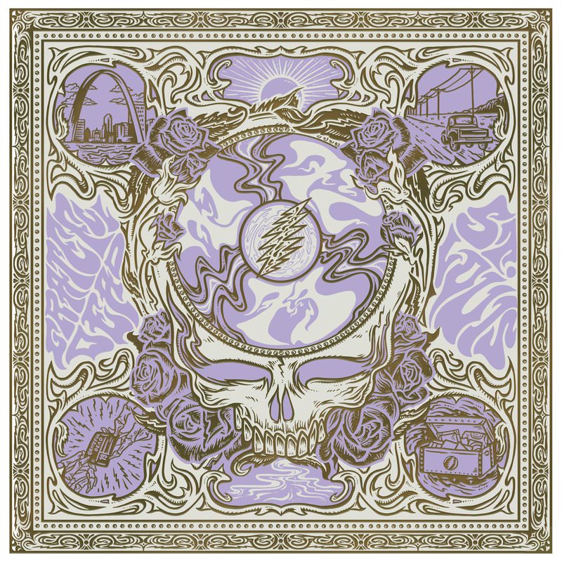
Listen to the River: St. Louis ’71 ’72 ’73 (2021)
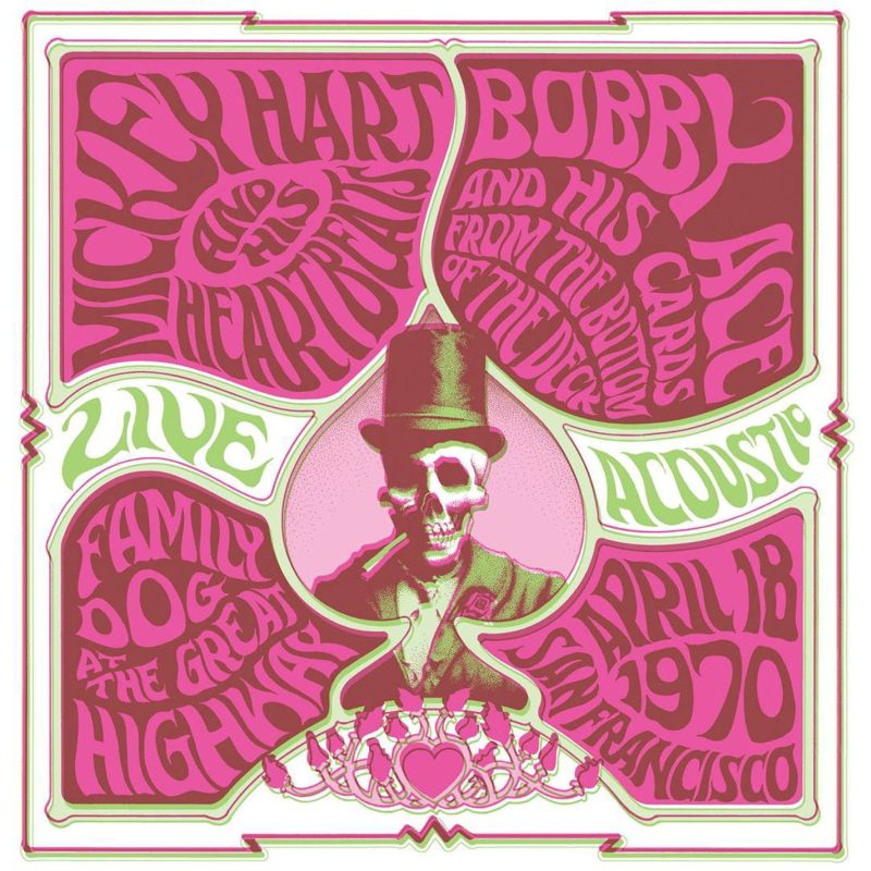
Family Dog at the Great Highway, San Francisco, CA 4/18/70 (2013)
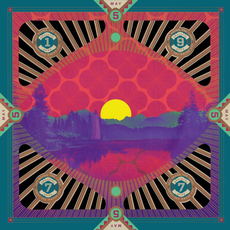
May 1977: Get Shown the Light (May 5, 1977 –New Haven, CT) [2017]
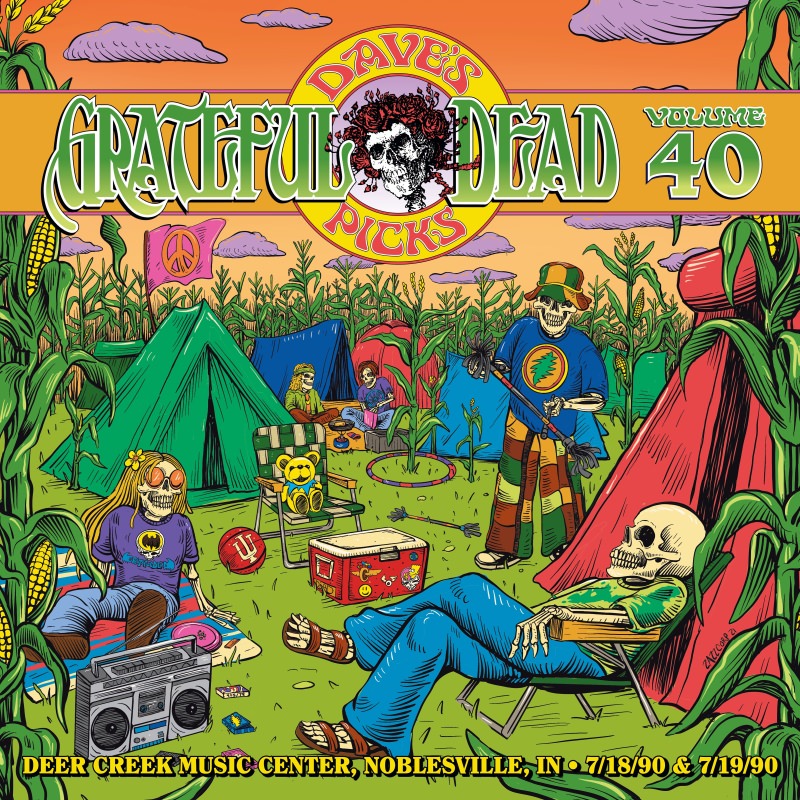
Dave’s Picks, Volume 40: Deer Creek Music Center, Noblesville, IN – 7-18-90 & 7-19-90 (2021)
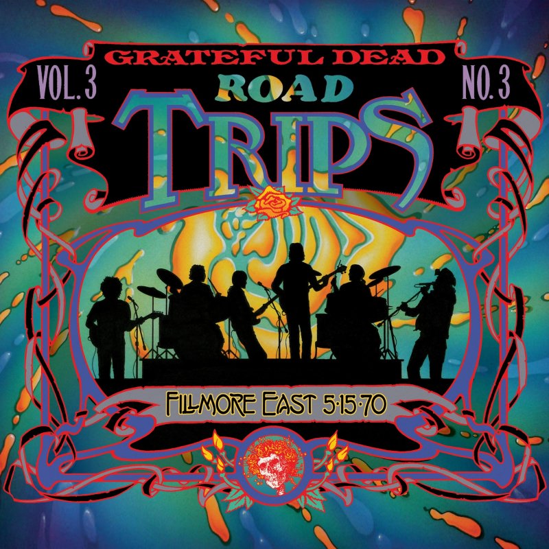
Road Trips, Vol. 3, No. 3: Fillmore East, 5-15-70 (2010)
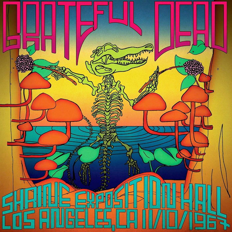
Shrine Exposition Hall, Los Angeles, CA 11/10/1967 (2016)
