The Story Behind Green Day’s Dookie Album Cover

Green Day’s 1994 breakout album, Dookie, is known for being jam-packed with irreverent classics like “Basket Case”, “When I Come Around”, and my personal favorite, “Longview”.
In addition to its status as a garage punk staple, Dookie also features the iconic Highlights magazine-inspired cartoon artwork that includes plenty of pop culture figures and — you guessed it — poop.
When Green Day were first starting out, they were notorious stoners, and the story goes that they actually named their band “Green Day” as a reference to spending the entire day getting zooted.
Naturally, even with a major label contract for this album, they still refused to take themselves seriously.
The original working title for Dookie, according to a 2014 Rolling Stone interview with frontman Billie Joe Armstrong, was actually Liquid Dookie in reference to what happened to their bowels after eating spoiled food on tour.
The band decided that this was too vulgar to use as the title to what would become their fan-favorite album, so they settled on the slightly less disgusting Dookie instead, and still had their fun with the album artwork.
Dookie’s cover art takes place on Telegraph Avenue Berkeley, California, and depicts dogs and monkeys flinging turds off the rooftops into the crowd gathered in the streets below.
The artwork was drawn by East Bay punk Richie Bucher, who had connected with the band through their onetime drummer John Kiffmeyer, as the two had played together in a band called Soup prior to John’s joining Green Day (then Sweet Children) in 1987.
According to a 2014 interview with the Portland-based paper Willamette Week, the band didn’t give Bucher much direction when they commissioned him to draw the Dookie album cover. He was simply given the album title and nothing else.
Bucher recalls being reminded of a fighter jet by some songs off their 1991 album, Kerplunk!, so he started by drawing that part and then mocked up the rest and showed it to the band.
With the green light given on the direction of Bucher’s drawing, he went to town populating the scene with all the zany ideas that were floating around in his mind.
This includes, but is not limited to, a fat Elvis Presley, a Chia Pet, mythical creatures, robots, cavemen, and more. You can stare at the cover for at least the album’s 38-minute run time and find something new to be amused during the entire experience.
In a 2018 interview with San Francisco Bay Area radio station KQED, Bucher reveals that he was inspired in part by the energy captured in the artwork of Gilbert Shelton (rather than Where’s Waldo? or Highlights). Specifically, his work on The Fabulous Furry Freak Brothers, and as a man after my own heart, the cover art for the Grateful Dead album Shakedown Street.
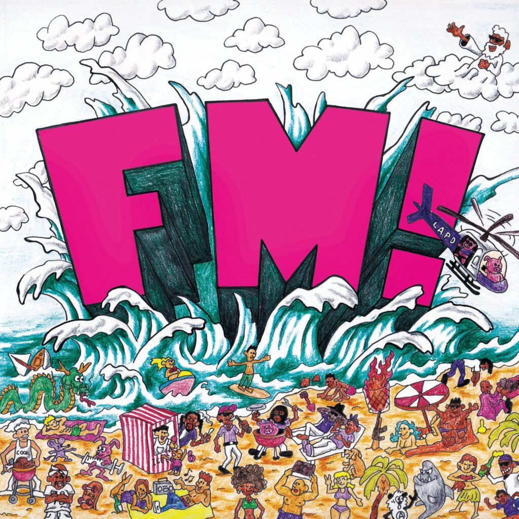
In this interview Bucher also discusses the 2018 Vince Staples album FM!, which features cover art that draws a clear influence from the Dookie cover art. Except instead of poo-flinging dogs in Berkeley, it depicts Staples’ hometown of Long Beach in a popping summertime setting.
Green Day’s Dookie is clearly remembered fondly among 80s babies and considered a childhood classic by the 90s babies, and the cover art continues to gather conversation and influence the music landscape as it ages today.
What’s your favorite find on the Dookie album cover?