Nirvana’s smiley face logo is one of the most simple band logos out there, yet it’s also one of the most recognizable.
That black and yellow happy face with crossed-out eyes has been a tried-and-true t-shirt design for edgy teenagers and cool dads ever since the early 90s. While it (and the band) started out in the dark underbelly of grunge music, nowadays the Nirvana logo about as mainstream as it gets.
However, one thing that has become a subject of controversy over the years, is who exactly designed the Nirvana Logo? This piece attempts to uncover that mystery.
The Birth of an Icon: Nirvana’s Smiley Face Logo
For the longest time, the going story was that Kurt Cobain drew the logo back in 1991. Right around the time that Nirvana released their famous album Nevermind, with its sensational single “Smells Like Teen Spirit”, and forever left their mark on the music industry.
Before we get into the dispute over who made the logo, let’s cover the basic facts. The things we know:
The logo first appeared on a poster for the private Nevermind album release party held on September 13th, 1991.
On that invitation, the smiley face was printed in black on a white background. It did not include the Onyx-font “NIRVANA” that it later became famous as a pair with.
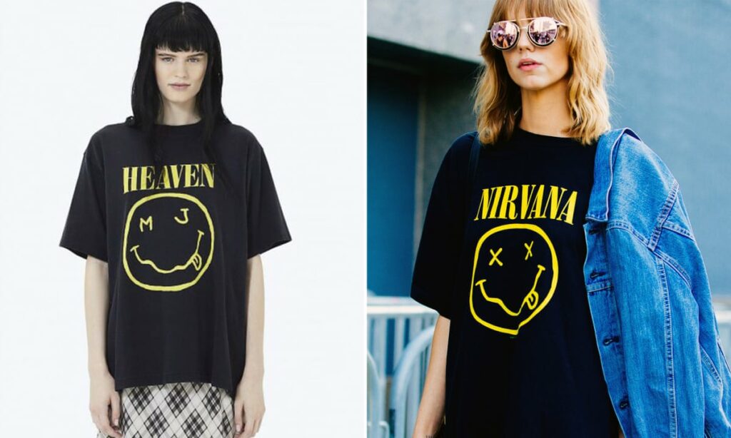
The logo later appeared on all of the band’s merchandise in the most well-known form: a yellow smiley face over a black background with the word “NIRVANA” printed over top in the Onyx font.
Why Onyx Font? The Pre-Logo Story
The choice of the Nirvana font dates back to before the smiley face logo, in the year 1989 when Nirvana released their debut record, Bleach, via Sub Pop records.
Sub Pop had a graphic designer and art director at the time named Lisa Orth (who is now a tattoo artist). She was the label’s very first official art director and she was responsible for designing Nirvana’s early records.
When she was asked to design the cover for Bleach, she paid typesetter Grant Alden $15 to use whatever font he had programmed into his machine at the time. Onyx was the one he spat out.
That was good enough for Orth. In her eyes, she was making an album cover for some no-name band, and she didn’t really give much thought to it.
Today, of course, the Onyx font is famous for being the Nirvana font. It went on to be printed on almost all of their subsequent releases.
Legal Controversy
Now it’s time to get into the juicy details. There has been an ongoing, controversial legal battle between fashion designer Marc Jacobs, who released a collection called Redux Grunge in 2018 that includes a spin-off of the Nirvana design that he crafted with some slight alterations.
Upon catching wind of this collection, the Nirvana estate filed a law suit against Jacobs for copyright infringement, claiming that Jacobs ripped off the Nirvana logo in the creation of his design.
It’s pretty obvious to anybody that Marc Jacobs did not actually design the logo from scratch. It’s a clear publicity stunt, piggybacking off a famous band’s art for capital gain.
The case has yet to reach a verdict on whether or not Jacobs will be found guilty of copyright infringement. It was delayed in 2020 due to COVID, and as of my updating this post in September 2023, still has not gone to trial.
However, this legal battle has brought to light new information about the creation of the Nirvana logo, bringing to question the common assumption that it was created by Kurt Cobain himself.
The Late Claim: Robert Fisher Enters the Stage
In September 2020, the former Geffen Records art director Robert Fisher came forward to claim that it was he who first drew the logo and not Kurt Cobain.
Now, this is a believable story as Fisher did indeed design much of the band’s artwork while they were on Geffen Records, but the question remains as to why in the heck he waited 29 years to come forward and claim his place as the designer?
Since the Marc Jacobs team is now trying to claim that the copyright is invalid since Cobain did not draw the logo, it makes this new development seem a bit suspicious.
Regardless, Marc Jacobs is getting a whole lot of free press for his Nirvana spin-off.
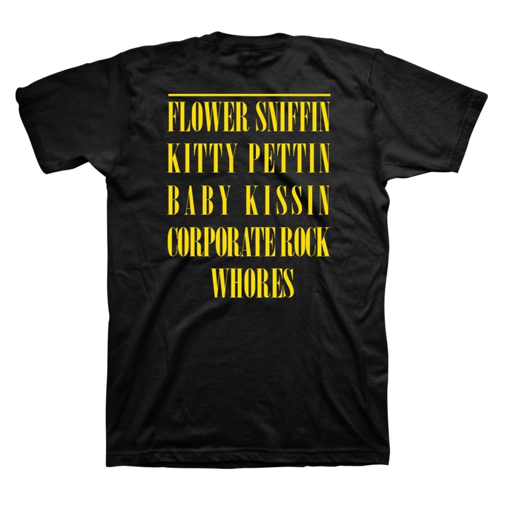
In my humble opinion this is one of those things that should never have become a law suit in the first place. It seems like a whole bunch of unnecessary drama over a few squiggly lines and a random font that some Flower Sniffin’, Kitty Pettin’, Baby Kissin’ Corporate Rock Whores made famous in the 90s.