The History and Meaning of the AC/DC Logo
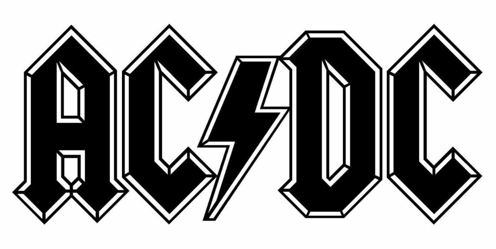
AC/DC are one of the most well-known and beloved rock bands of all time. Their simple, typeface logo emits the raw electric power that is present in the music and live performances. Speaking of electric power, the voltage icon used in the logo even captures the meaning of AC/DC, which refers to switching between two types of power: Alternating Current or Direct Current.
The AC/DC logo as seen on t-shirts everywhere today was designed by Gerard Huerta, who was in his early twenties and working as a typography designer for Atlantic Records. It went through a few forms before reaching the iconic final evolution that we know and love today.
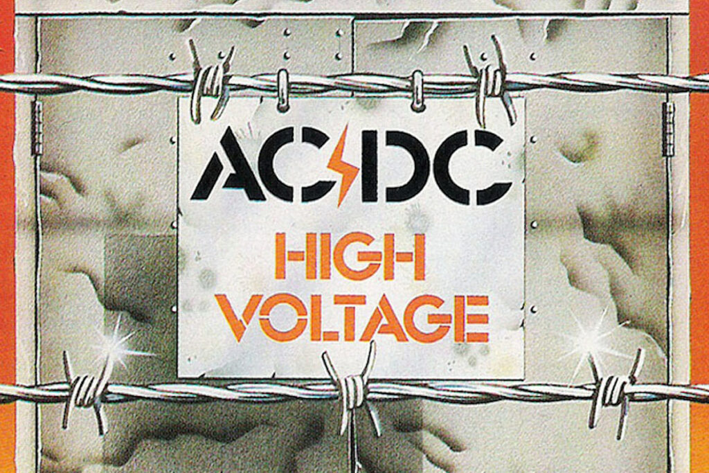
The original AC/DC logo appeared on the Australian edition of their debut album, High Voltage (1975). This was the very first logo that they every used, presumably designed by the band or somebody close to them. It features basic stenciled lettering and the introduction of the high voltage (lightning bolt) symbol that was included on almost every other iteration of the logo.
AC/DC’s first two albums, High Voltage and T.N.T. (1976) earned them massive success in Australia, and eventually led to them being signed to an international deal with Atlantic Records. This leads us to our young designer, Gerard Huerta.
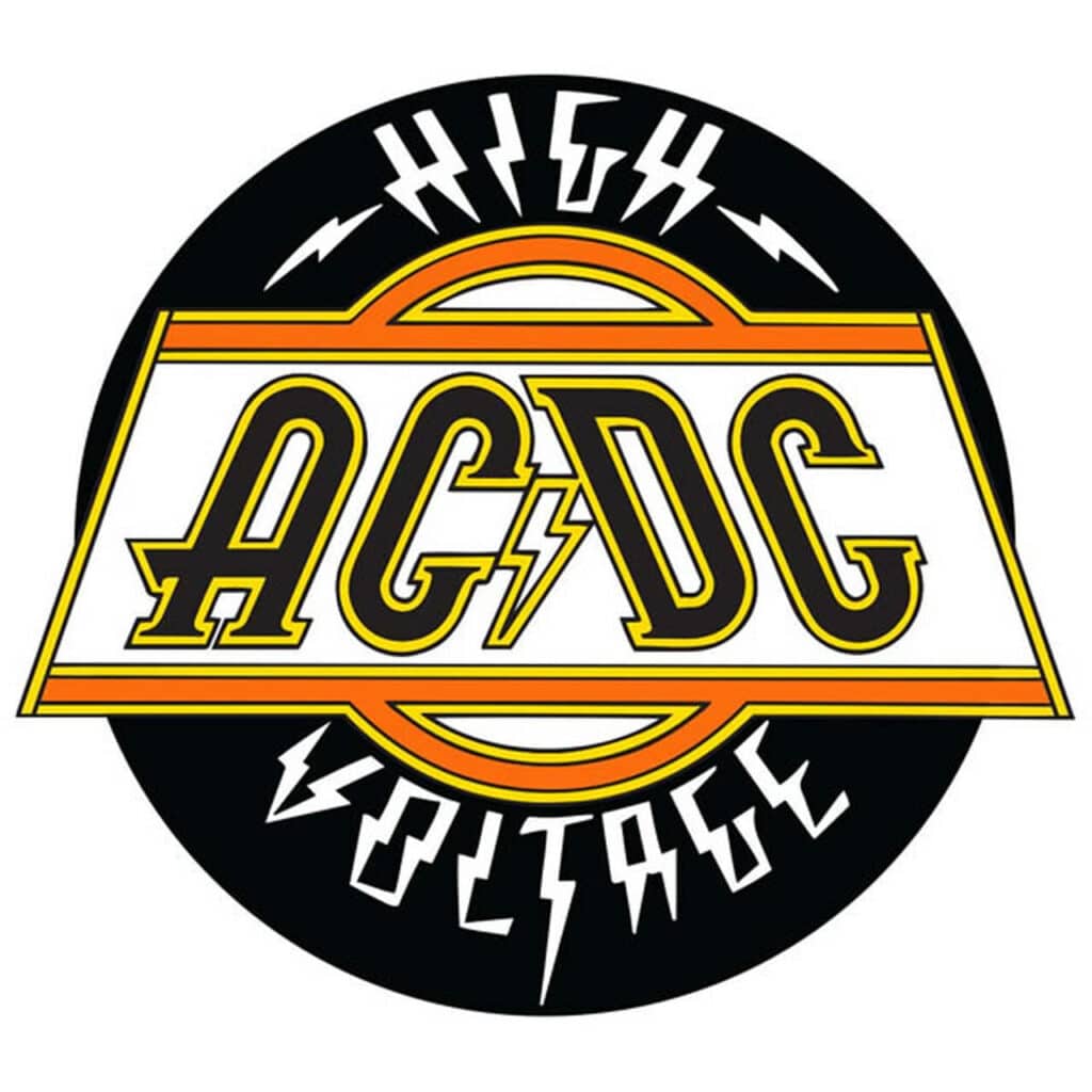
Atlantic was set to release the International version of High Voltage, which included tracks from both the Australian release and T.N.T., and Gerard Huerta was assigned to create some typography for it. This was just any other assignment to him, but it created the beginnings of a logo that would soon be powered by one of the biggest rock bands in the world.
After the in international version of High Voltage (1976) came Dirty Deeds Done Dirt Cheap (1976). The Dirty Deeds AC/DC logo stuck with the typography element, but ditched the high voltage symbol in favor of a plain old slash. The album cover is certainly cool, but the AC/DC logo used on it doesn’t capture the hard rocking energy of the band. The pink bubble letters used by designers Hipnogsis are too laid-back, and remind one of a California surf rock energy. That simply is not AC/DC.
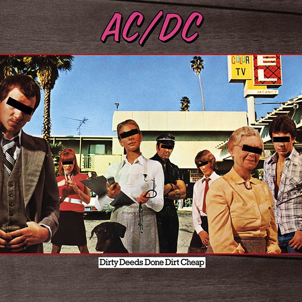
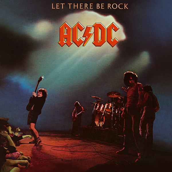
Dirty Deeds Done Dirt Cheap was only released in Australia until 1981, when it was given an international release. This was before the internet, meaning that this logo was not widely seen outside of Australia until 1981, and by that time the main AC/DC logo had already been introduced on 1977’s Let There Be Rock, and therefore was set in stone.
As was the case with the High Voltage cover art, Huerta’s hand in the Let There Be Rock design was not some big creative aspiration. AC/DC had yet to become superstars (they would reach #1 in the U.S. with 1979’s Highway to Hell), and he had no way of knowing that his logo design would become permanently etched into the global pop culture landscape. He simply collected his one-time pay for the project and moved on to the next one.
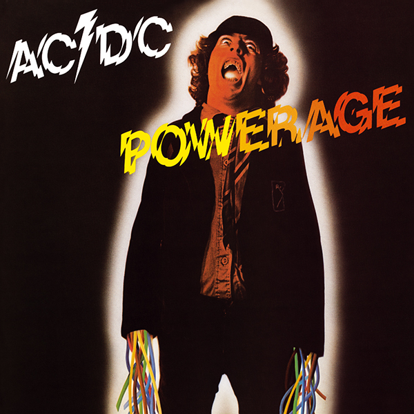
While AC/DC had their iconic logo in the bag, perhaps they didn’t know it yet because they strayed away from the Let There Be Rock logo one final time on their follow-up release, 1978’s Powerage.
This album was designed by Bob Defrin, Huerta’s boss at Atlantic, and it features an electrified version of the logo that simply doesn’t look as good. I guess they realized this at some point, because every AC/DC release from 1978 onward features the memorable Gerard Huerta design.
