How the Wu-Tang Clan Got Their Logo

In the world of hip-hop, there is perhaps no name more recognizable than the Wu-Tang Clan. Formed in New York City in 1992, Wu-Tang made a name for themselves with down and dirty rhymes that put East Coast hip-hop on the map and forever left their mark on the genre as we know it.
Almost as recognizable as the name is the Wu-Tang Clan logo, the black and yellow stylized letter “W” broken down the middle by the words “Wu-Tang”.
Much like the hip-hop legends behind the logo, the Wu-Tang logo has come to symbolize hip-hop culture and has remained an extremely popular t-shirt and merch design ever since its inception in 1992.
The story goes that Wu-Tang had been working out some ideas with their official DJ and sometimes producer Mathematics (a.k.a. Ronald Bean) for the group’s logo, and the symbol evolved from those discussions.
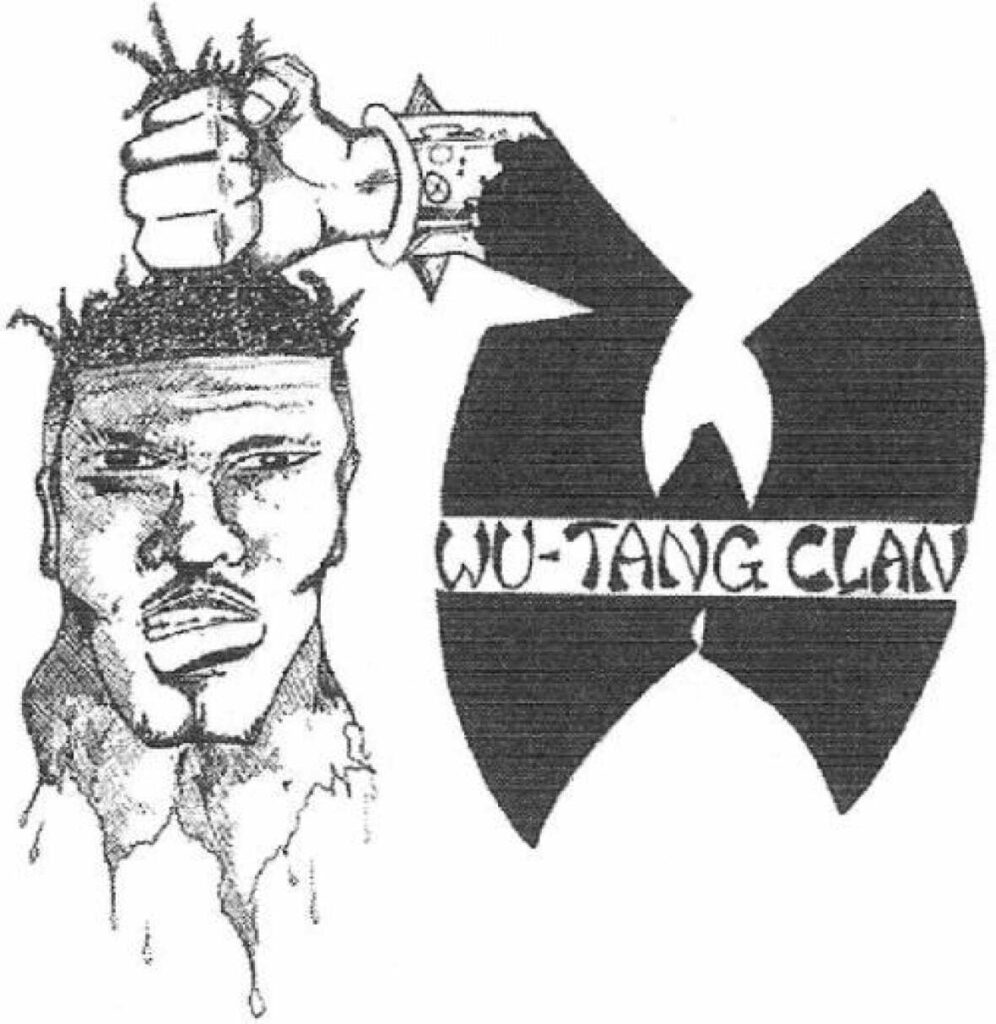
Wu-Tang founding member RZA explains in a 2017 interview on Power 106 Los Angeles that the initial idea they had been wanting was an image of a dreadlocked severed head being held in the air, with blood dripping from the neck, as to say “Protect Ya Neck”.
When Mathematics came to them with his initial visual mock-up of that idea, with the Wu-Tang “W” holding up a decapitated head, the group agreed that it was too much and had to go in a different direction.

From there, the idea for a Wu-Tang symbol continued to simmer until a last-minute deadline made the decision for them. RZA explains that he reached out to Mathematics saying that they had to print up some stickers the next day and they needed a logo for them right away.
In that moment they settled on dropping any other embellishments and simply using that graffiti letter “W” as the logo, and thus creating the most famous hip-hop logo of all time.
So while the logo itself was designed in a short spurt, the creative process for it took place over several months, and fell into place in a moment where everybody knew that it was the right move. But nobody could have known exactly how monumental that logo would become.
According to the 2019 Showtime documentary Wu-Tang Clan: Of Mics and Men, Mathematics was paid a mere $400 for the logo.
Watch the 2017 radio interview where RZA explains the creation of the Wu-Tang symbol below.
Mathematics also did a ton of other design work for the Wu-Tang Clan and its members, with much of it being inspired by the original Wu-Tang symbol that had become representative of the entire Wu-Tang brand.
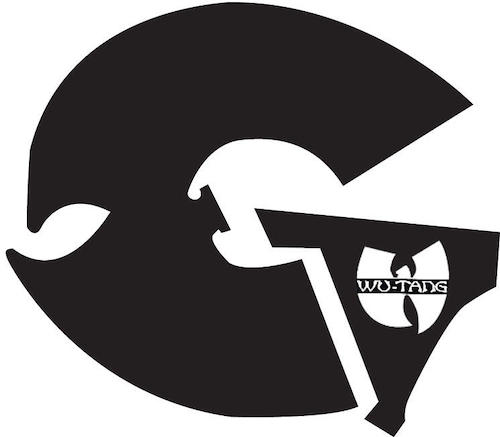
In 1995, Mathematics designed the cover art for the iconic GZA album Liquid Swords (1995), which included the design of a logo for GZA himself.
To do so, he took the Wu-Tang “W” and flipped it on its side and modified it to form a letter “G”, thus making the GZA logo that became the official symbol for all his solo releases thereafter.

Mathematics also designed the Method Man logo in a similar way, taking the Wu-Tang “W” and flipping it over its head to form the letter “M”, with some modifications to fit the tastes of Method Man himself. The Method Man logo first appeared on his solo debut, Tical, in 1994.

In this same fashion Mathematics also designed a logo for one of Wu-Tang’s more laid-back founding members, Inspectah Deck. For his logo the Wu-Tang symbol was used for the letter “e” in his name.
